Pages

Tuesday, September 28, 2010

Animal Morphing

The animal I chose is a ladybug. I am attempting to draw a ladybud in a variety of styles using various photos and clipart as inspiration.

My first attempt was a realistic drawing of a ladybug. To draw this one, I looked at various gardening websites. I think the lines are good but it ended up looking more like a roach.


This is my attempt at drawing a cartoon ladybug. It came out nice but not very original.


This is my favorite drawing. It is a ladybug forced into a circle. i like the roundness of it. Even the legs have some curvature to them.


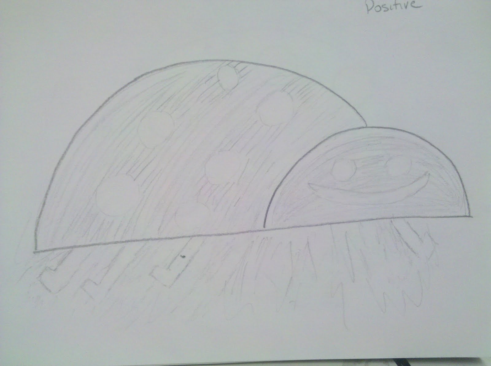
This ladybug is a negative composition. I was attempting to have a negative/positive transposition. Didn't exactly work out. I'll be re-doing this one.


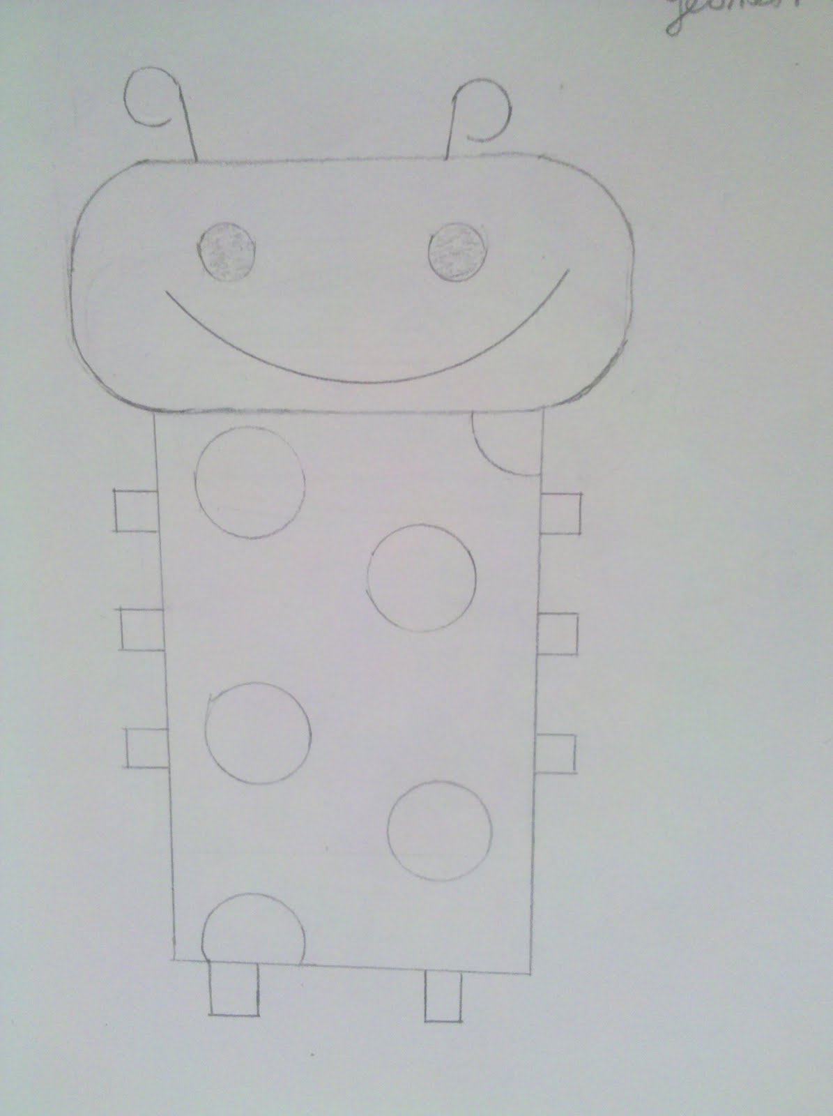
This ladybug is in geometric form. I like this one. There's a log of straight lines here which really appeal to me.


Here is my robotic ladybug. Well, it does look robotic but does it keep the essense of a ladybug? Not quite sure.


Finally, this is my "stretched" ladybug. While I like the expression on the face, it is starting to look more like a beetle than a ladybug.


 I really like this one. It is the Tribal Ladybug. You don't want to mess with her! ha ha


This is one of my favorites and I think it came out very nice. It is an "exploded" or "break apart" picture of a ladybug. There are a lot of very nice geometric shapes that can be clearly seen here.
*No ladybugs were harmed in the drawing of this picture.


I'll be redoing these pictures as well as adding more style. I am learning to look at the simplest things in more detail.

Pencil Shading

This assignment was to fill a page with overlapping shapes that run off the page on all sides. Well, I didn't do a very good job of this but I will try again and upload the result. This was a bit hard because I wasn't able to do it without actually looking at a subject. I ended up using a desk on the far side of the classroom. When I try it again, I will be sure to have a good subject to look at.

Wednesday, September 22, 2010

Paper Drawings


This was a fun project to do but it had me sweating bullets in the beginning. I've never done anything like this before.  We took a picture and recreated it using only black construction paper. I'm not quite sure if I got it right but I really like the final result. I think this is one project that I will do again and again.

Tuesday, September 21, 2010

Shapes - Organic, Geometric & Positive/Negative


These are just a few of my shape pieces. The shapes are cut from construction paper and glued to my sketch book. I enjoyed making them. It was interesting to see what designs came out of my head!

2-D and 3-D Arrows

The assignment here was to create a full page composition using a combination of 3-dimensional and 2-dimensional arrows. I drew a few rough drafts, not really liking the arrangement of the first drawing. Once I decided on the layout, I draw and carefully colored in the arrows, making sure to show how some of the arrows overlapped others. I showed a 3rd dimension by drawing a side wall and coloring it a darker color than the arrow. This was good practice for showing the difference between 2 dimensional and 3 dimensional.


Thursday, September 16, 2010

Echos

The object of this drawing is to have a free form line and have other lines flow into it, echoing the pattern. For some reason, it was hard for me to complete this project. I did several sketches but none of them satisfied me. I finally chose this design. It does have a nice flow to it and I really like the brightness of the yellow. The colors tend to pop. I may try this again and see if I can get a nice flow going.

Saturday, September 11, 2010

Contour

For my two contour drawings, I selected two different items. I attempted to focus on the outline of the subjects, adding details but no shading. My goal was to add enough detail to make identification of the subject easy. This was my first real drawing and it was a bit difficult. I had to concentrate on the edges of the subjects.

This is a small coke bottle that is not as stubby as it turned out. On the whole, I am pleased with this drawing. It is recognizable as a coke bottle. There may be too much detail, I'm not sure.


After drawing the bottle, I decided to try a second contour drawing. This time, I used my hand as the subject. I am very surprised at how much detail I saw when looking at my hand. I am not in the habit of looking so closely at things. This exercise was very good in opening my eyes to the different views there are of a single subject.


Tuesday, September 7, 2010

Directional Lines

I like this drawing. I think it definitely show movement. I like the jaggedness. It's vivid and jarring.


This is my second attempt

My original drawing had good lines but there was not much movement. This drawing definitely has definition. You can clearly see the lines moving, bending and folding into itself. It is a much stronger image.

Expressive Lines


Well, this is my first attempt at art. I was trying to convey a sense of serenity. I drew a young girl walking down a calm road. The zagged line at the top is a thunderstorm off in the distance. The object in the upper right is a carnival cart, signifying youthful fun and carefree days.


This is my second attempt.

I started drawing and noticed that one of my images looked like a flattened soda can so I started playing with a metal theme. The clouds are "staples", the road is a zipper and the tree limbs are metal shavings. I like this drawing better. There is definitely more expression in this drawing.