Pages

Tuesday, December 14, 2010

Final Design


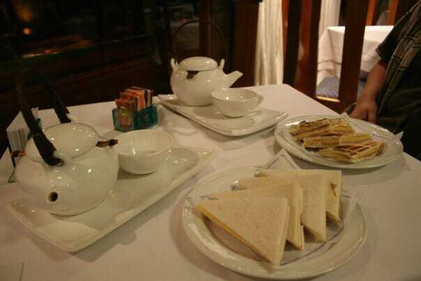
Tea & Sandwiches in Tucuman, Argentina
So we have come to the final project of our class. We have the freedom to choose any project, any design, any medium to work with as long as it incorporates what we have learned in class. I thought long and hard and decided to work once again with acrylics. I enjoyed my first painting and wish to recreate that feeling of satisfaction. For my inspiration, I went back to a missions trip to Argentina. I was part of a group of ladies who were assisting in a conference for women and young ladies. After spending several hours visiting fabric stores for decorating, my friend and I returned to the hotel tired. We went to the dining area and literally fell into our seats. The headwaiter, seeing our exhaustion, recommended a light meal of tea and sandwiches. What we received was much more than that. Special attention to details and anticipating our every need left us feeling soft, warm and fully satisfied. I felt very special. I wanted to recreate that feeling with my final project.


One of my many Japanese tea sets.
 
I love teapots and tea sets and collect them everywhere I go. One of my sets is a beautiful cream color with cherry blossoms. This was the set I selected. Because I would be painting on an ivory canvas, I wasn't sure if I could do justice to the color. Instead of an ivory cream, my painting would have a light pink set. Also, I decided against drawing the Japanese lettering. In order to see the contour of the teapot more clearly, I printed a black and white copy of my subject. This allowed me to study the curves and the perspective of the set. 

 
black and white copy
Although I did not intend to create a monochromatic painting, my project ended up mostly in shades of red. I did add the cherry blossom tree with it's green leaves. Since I did not have a background to work with, i decided to add a "spotlight"effect by encircling it with deep rose colors. This worked very well, giving it a warm and cozy feel to it. I'm very happy with the end result. When I look at the painting, it takes me back to the same feeling of feeling safe and pampered as my visit to the Argentine hotel.


My completed project


Tuesday, November 23, 2010

Typography

This week we are learning about typography. We have three assignments.

The first one is to create a "ransom" note by cutting letters out of magazines. The idea is to use the fonts to create a dramatic demand. My ransom note reads "Drop the salad and no one gets hurt" It is signed by Mars, a familiar name in chocolate! I looked for fonts that looked like junk food, and found a PopTart "S" and a Willy Wonka "M". Actually, it is a "W" but I turned it upside down. This was a nice project that opened my eyes to the many ways font can be used to deliver a message.


Our second assignment was to take a sentence and write it out using fonts to make the sentence look like what it says. Hmm, that sounds confusing. Basically, we had to "write" an expressive sentence. I selected the sentence "They were saturated with happiness". I drew all the "T"s to look like umbrellas and the "r"s to look like leaking water faucets. The rest of the letters were puffed up as if full of water. There are also some drops on them. I used a mixture of oil paints, markers and water colors for this project. The idea was to make it look as if all the letters were so full, so saturated with water that they looked ready to burst.


The last asssignment dealing with typography was to create a logo with our initials. I shall be uploading that soon.

Implied & Tactile Collage

My assignment here was to create a collage using two styles. The first format, implied, was to have the illusion of a textile. The second format, tactile, was to have actual 3D materials. I chose the same picture of a field with a tree and mountains for both formats.

Implied Collage


To make the waves of golden fields, I used cuttings of wavy hair. From far away, it does not look like hair. The mountains are pictures of tweed coats and the tree trunk is a leather purse. For the tree, I did a rubbing of mesh.


Tactile Collage

Using the same picture, I gathered materials that are similar in look to my original collage. The field this time is made of burlap and has a smattering of green in it. I've also added some grassy areas with a few flowers. The tree is made out of feathers wtih leaves cut from a fabric. The mountains were fun to make. I put a smathering of glue and let it dry for several days. On a piece of paper, I put 2 separate squirts of black and white acrylic paint and using a sponge, I touch lightly over both and dabbed the glue. To finish it off, I outlined the mountains using a big of black rick rack. Finally, I dabbed blue and white paint above the mountains and glued white filmy material, outlining with white round ribbon to create the clouds.


I think the implied collage needs work but I'm pretty happy with the tactile collage.

Friday, October 15, 2010

Acrylic Painting


Original picture
 Okay, I have to admit that this one made me nervous. The assignment was to paint a picture using the color we chose for our value scale.  I picked what I hoped was a relatively easy picture to paint. It is a simple flower in a small vase surrounded by a few rocks and water. The color I chose was red because that is my favorite color. Once the outline was sketched out, I decided on the lightest shade and started there. The picture went pretty smooth and easier than I expected because there were large patches of color rather than a lot of small patches.


Me concentrating

It was a bit difficult deciding which shade to use on the non-red portions of the picture but having my value scale nearby made it easier.  When I finished the large areas, I went and added shading and highlights. I then lined the different items in the picture to make them stand out. Once I felt I could not do anything else to improve it, I stopped.  I am very happy with the painting.


Final painting

This was my very first time painting with acrylics and I enjoyed it very much. In fact, I am already planning my next painting!

Thursday, October 14, 2010

Oil Pastel picture

We are working on acrylic painting in class this week. I thought I'd try painting a smaller version of the same picture but with a different media. I painted this picture using oil pastels. After sketching out the picture, I filled it with the oils then went over portions of it with watercolors. I think it gave it a nice look. I changed the background a bit to make it look more like a water lily type flower, floating in the water. What do you think?

Branching out

This assignment was to draw a landscape wtih one tree or bush that has a personality. Well, I have no landscape and two trees. Believe it or not, this is the paneling inside one of the elevators in my office building. All three walls have this type of "wood markings". Makes for a very uncomfortable ride when you're alone in there! They remind me of the trees in Fantasia.

I plan to re-do this assignment.

Friday, October 8, 2010

Value Scales

Today's assignment was to create 2 value scales. The first one is a gray value scale and was created using photos from magazines. It was a challenge to put this one together because each time I thought I had 10 values, I looked closely and found blue or brown hues in the photograph. Once I had my values ready, I pasted them on a white bar then onto a black matte board. This keeps the values at the end from completely disappearing into the background. Looking at this picture, there are several values that look very similiar but in person, there is a greater difference in the tones.


Friday, October 1, 2010

Roller Coaster Contrast

This assignment was to draw at least 6 continuous bands of color. Each one needs to reach at least 2 sides of the paper and must cross or be crossed by at least 2 other bands.
I loved doing this one. it was a bit difficult getting the bands the same width throughout its path and deciding how to cross them but once I had that in place, the fun began. I like the colors. If you look very carefully, you can actually travel the path of each band. I used a darker shade to show where a band goes under another band. I'd like to try again using darker colors. The challenge there will be to show the shading and shadows.

Tuesday, September 28, 2010

Animal Morphing

The animal I chose is a ladybug. I am attempting to draw a ladybud in a variety of styles using various photos and clipart as inspiration.

My first attempt was a realistic drawing of a ladybug. To draw this one, I looked at various gardening websites. I think the lines are good but it ended up looking more like a roach.


This is my attempt at drawing a cartoon ladybug. It came out nice but not very original.


This is my favorite drawing. It is a ladybug forced into a circle. i like the roundness of it. Even the legs have some curvature to them.


This ladybug is a negative composition. I was attempting to have a negative/positive transposition. Didn't exactly work out. I'll be re-doing this one.


This ladybug is in geometric form. I like this one. There's a log of straight lines here which really appeal to me.


Here is my robotic ladybug. Well, it does look robotic but does it keep the essense of a ladybug? Not quite sure.


Finally, this is my "stretched" ladybug. While I like the expression on the face, it is starting to look more like a beetle than a ladybug.


 I really like this one. It is the Tribal Ladybug. You don't want to mess with her! ha ha


This is one of my favorites and I think it came out very nice. It is an "exploded" or "break apart" picture of a ladybug. There are a lot of very nice geometric shapes that can be clearly seen here.
*No ladybugs were harmed in the drawing of this picture.


I'll be redoing these pictures as well as adding more style. I am learning to look at the simplest things in more detail.

Pencil Shading

This assignment was to fill a page with overlapping shapes that run off the page on all sides. Well, I didn't do a very good job of this but I will try again and upload the result. This was a bit hard because I wasn't able to do it without actually looking at a subject. I ended up using a desk on the far side of the classroom. When I try it again, I will be sure to have a good subject to look at.

Wednesday, September 22, 2010

Paper Drawings


This was a fun project to do but it had me sweating bullets in the beginning. I've never done anything like this before.  We took a picture and recreated it using only black construction paper. I'm not quite sure if I got it right but I really like the final result. I think this is one project that I will do again and again.

Tuesday, September 21, 2010

Shapes - Organic, Geometric & Positive/Negative


These are just a few of my shape pieces. The shapes are cut from construction paper and glued to my sketch book. I enjoyed making them. It was interesting to see what designs came out of my head!

2-D and 3-D Arrows

The assignment here was to create a full page composition using a combination of 3-dimensional and 2-dimensional arrows. I drew a few rough drafts, not really liking the arrangement of the first drawing. Once I decided on the layout, I draw and carefully colored in the arrows, making sure to show how some of the arrows overlapped others. I showed a 3rd dimension by drawing a side wall and coloring it a darker color than the arrow. This was good practice for showing the difference between 2 dimensional and 3 dimensional.


Thursday, September 16, 2010

Echos

The object of this drawing is to have a free form line and have other lines flow into it, echoing the pattern. For some reason, it was hard for me to complete this project. I did several sketches but none of them satisfied me. I finally chose this design. It does have a nice flow to it and I really like the brightness of the yellow. The colors tend to pop. I may try this again and see if I can get a nice flow going.

Saturday, September 11, 2010

Contour

For my two contour drawings, I selected two different items. I attempted to focus on the outline of the subjects, adding details but no shading. My goal was to add enough detail to make identification of the subject easy. This was my first real drawing and it was a bit difficult. I had to concentrate on the edges of the subjects.

This is a small coke bottle that is not as stubby as it turned out. On the whole, I am pleased with this drawing. It is recognizable as a coke bottle. There may be too much detail, I'm not sure.


After drawing the bottle, I decided to try a second contour drawing. This time, I used my hand as the subject. I am very surprised at how much detail I saw when looking at my hand. I am not in the habit of looking so closely at things. This exercise was very good in opening my eyes to the different views there are of a single subject.


Tuesday, September 7, 2010

Directional Lines

I like this drawing. I think it definitely show movement. I like the jaggedness. It's vivid and jarring.


This is my second attempt

My original drawing had good lines but there was not much movement. This drawing definitely has definition. You can clearly see the lines moving, bending and folding into itself. It is a much stronger image.

Expressive Lines


Well, this is my first attempt at art. I was trying to convey a sense of serenity. I drew a young girl walking down a calm road. The zagged line at the top is a thunderstorm off in the distance. The object in the upper right is a carnival cart, signifying youthful fun and carefree days.


This is my second attempt.

I started drawing and noticed that one of my images looked like a flattened soda can so I started playing with a metal theme. The clouds are "staples", the road is a zipper and the tree limbs are metal shavings. I like this drawing better. There is definitely more expression in this drawing.

Tuesday, August 31, 2010

Inspiration


Anne Geddes (born September 13, 1956)


Anne Geddes is an Australian photographer best known for her portraits of babies. From a young age, she was interested in images and how they can capture a moment in time. Although she spent countless hours photographing, she did not consider becoming a photographer until the age of 25. There were no photography classes available to her as a student. She spent many years as an unpaid assistant to a local photogapher learning the trade. Anne was a wedding photographer but it was sometimes a difficult dealing with stressed brides and their families. This was when she decided to concentrates on babies.


A self-described “baby freak”, she believes portraits should not be “stiff and formal” but rather reflect the personality of the subjects.

Her photos have babies in various poses and costumes. I love the peacefulness, the calm that the babies display in these photographs.

You can really see their different personalities.

This photo is one of my favorites. It is a preemie who struggled to survive and is now a beautiful young girl. In one of her books, Anne has brought back her "babies", now much older and posed them in front of their photos.


I would love to be able to, as Anne Geddes said, "capture an exact moment in time that could never be repeated".